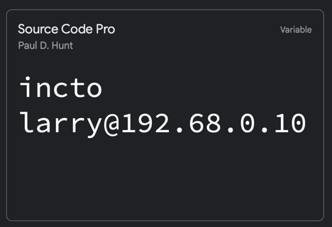
As I’ve been doing more work in the terminal, I’ve been cycling through some monospaced fonts this week.
Something that I really enjoy about typography is how subtle details, like curves, and line weights can make such a difference. It doesn’t have to be big, or flashy to make a font feel “right” for the job.
I try not to ponder a font right after a change. I’ll just choose a font and live with it. Some fonts don’t last long, others take some time. But, so far, every one is a little “scratchy” to my eyes.
But, I’ve been very pleased with Source Code Pro, from Google.